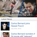
We are proud to launch the all new design of 24spoilers.com, a complete overhaul of our previous website. You’ll notice a modern design that should be easier to navigate while also loading faster.
What’s new? You can now browse updates by season with our new 24 series page. Our 24 music section is a lot more visual with a new album art view. All category and tag pages have a new ’tile’ view with beautiful widescreen images that should allow you to more quickly identify stories. Take a look at the 24 Season 8 Promos page for example of this new interface.
In some sections of the site such as video interviews you’ll notice a “filter” button in the top right that will allow you to drill down further. In this example you can display only interviews by a specific actor or actress (Elisha Cuthbert video interviews for example).

There’s also an entirely new touch-optimized mobile website as well for iPhone and Android users. It can do everything the real site can – from browsing, to searching, to watching videos. Almost all of our videos have been converted from Flash to HTML5 so they will now play back on smartphones and tablets.
This has required a large amount of work – going through thousands of older posts to either add or update images, fixing broken links, converting videos, and various other tasks. Please be aware that we’re not 100% finished yet, so you might come across some missing images and other oddities, especially in our older posts from several years ago. Rest assured we are working on it.
If you notice any browser quirks or have suggestions or complaints, please let us know via the comments or contact form. Hope you like it!

9 Comments
Comments ClosedCatherine
July 24, 2012 at 6:40 pm24bauerfan
July 24, 2012 at 7:10 pmTatyana
July 24, 2012 at 7:54 pmGerry Mander
July 24, 2012 at 8:35 pmAndrew
July 24, 2012 at 9:58 pmJomskylark
July 25, 2012 at 1:17 pm24 Spoilers
July 27, 2012 at 10:04 pmiran
January 7, 2013 at 5:49 amMVCC
May 12, 2013 at 9:29 pm