The Hollywood Reporter has exclusively revealed the first images from the 24: Live Another Day sets in London along a room-by-room breakdown from production designer Jonathan Lee. He was given just eight weeks to conceptualize and design these various sets and drew inspiration from the films Three Days of the Condor and Gosford Park.
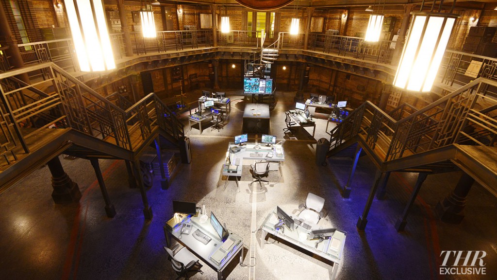
The unofficial CIA headquarters is set inside an art deco building. “All the detailing — the metal work, the columns, the handrails and the staircases — all have an industrial art-deco feel to them,” Lee says. “When the CIA takes it over, they’ve brought in the ultra-modern technology.” Though it may seem like the railings and such are metal, Lee reveals that it’s just a Hollywood trick: They’re actually made out of plaster, painted over to look aged. The oversized lamps overhead also provide the majority of the set’s lighting.
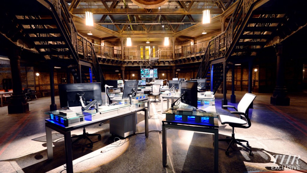
The main bullpen on the CIA set is where most of the action takes place on 24: Live Another Day and though the image only showcases the central area, there are a lot of unseen areas viewers will discover. Under the columns on the left is a large conference table for likely debriefs, for instance. “There’s a whole world beyond it — of offices and corridors that go all around the back,” says Lee, who called the CIA set the most challenging to conceptualize “because it didn’t exist.”
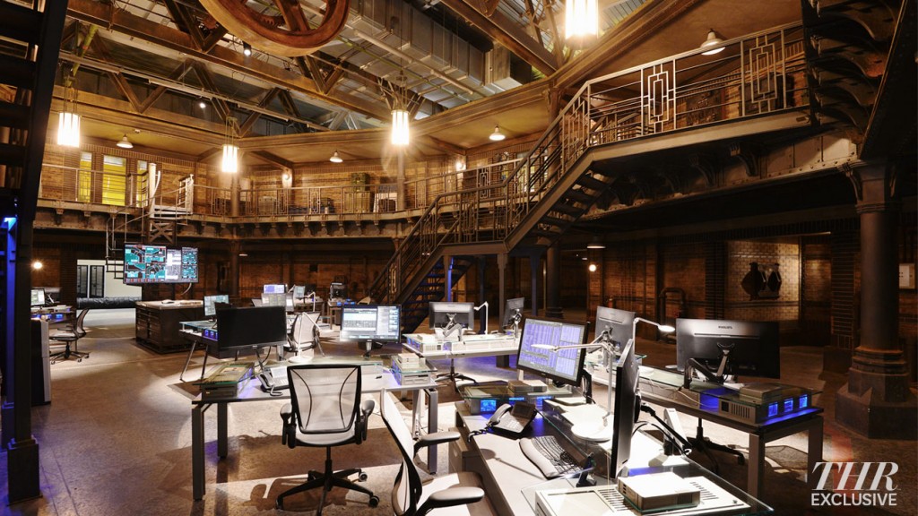
“The CIA in this show is supposed to be a deniable black site in Britain. It doesn’t officially exist, so they’re hiding away,” Lee says of the set’s dark palette. “We didn’t want it to be bright, shiny, new or in a new building.” The look and feel was inspired by Britain’s industrial history, a point of interest for 24 producers Manny Coto and Evan Katz.
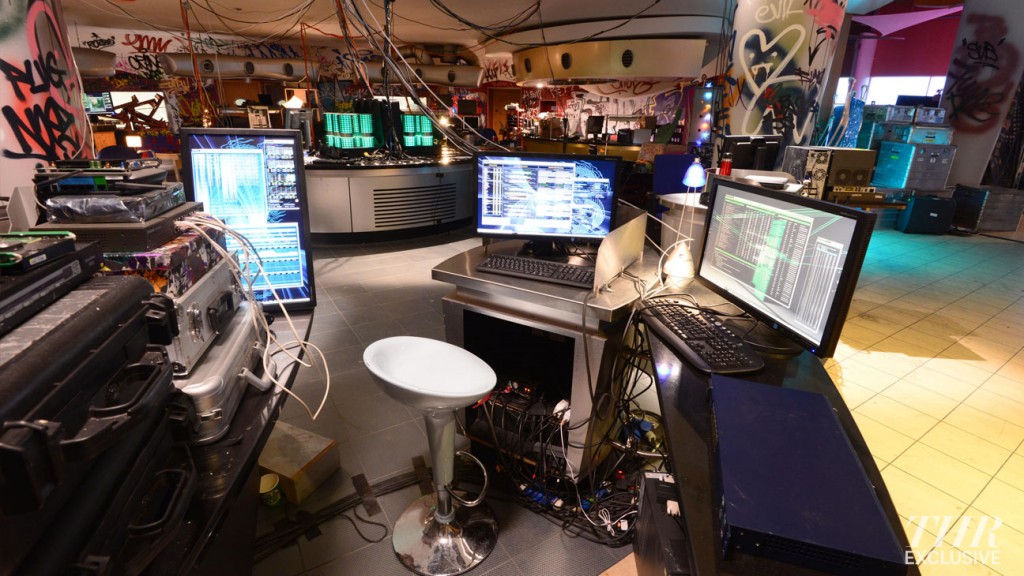
Chloe’s hacker hub was originally scripted to be in a church but “it ended up looking a little bit like the CIA,” Lee admits, prompting them to go “down a whole different route.” Because she works for “a Julian Assange/Wikileaks kind of guy,” it was important for the space — an abandoned restaurant in an old Gillette factory — to feel temporary yet personalized (i.e. wall graffiti), as well as “colorful” and “anarchic.” “We built these green computer servers in the middle of the shot; they’re like suitcase units, so everything’s very mobile,” Lee says. “They could close all this stuff up in an hour’s notice and be gone before the police raid the place.”
Check out the full article at THR for pics and info on the President’s Private Office, The State Room, and the Chief of Staff’s Office.
7 Comments
Comments ClosedShawn
March 24, 2014 at 12:56 pmChlojack
March 24, 2014 at 2:15 pmXAM
March 24, 2014 at 4:08 pmGod dammit, NO!!! The less time we have to spend with those generic and shitty characters the better.
On a positive note, compared to previous agency sets/gratuitous exposition rooms at least they’re a little more creative this time. Nice work, Jonathan Lee.
Chlojack
March 24, 2014 at 5:01 pmTJ
March 24, 2014 at 9:52 pmPersonally, the CTU HQ of Season 8 was the best design of them all.
Jack
March 24, 2014 at 10:00 pmmoses
March 24, 2014 at 10:11 pm